Letter spacing survives the PDF. Kerning does too.
We set tracking on 10 Google Fonts at six sizes, exported to PDF and measured every letter.

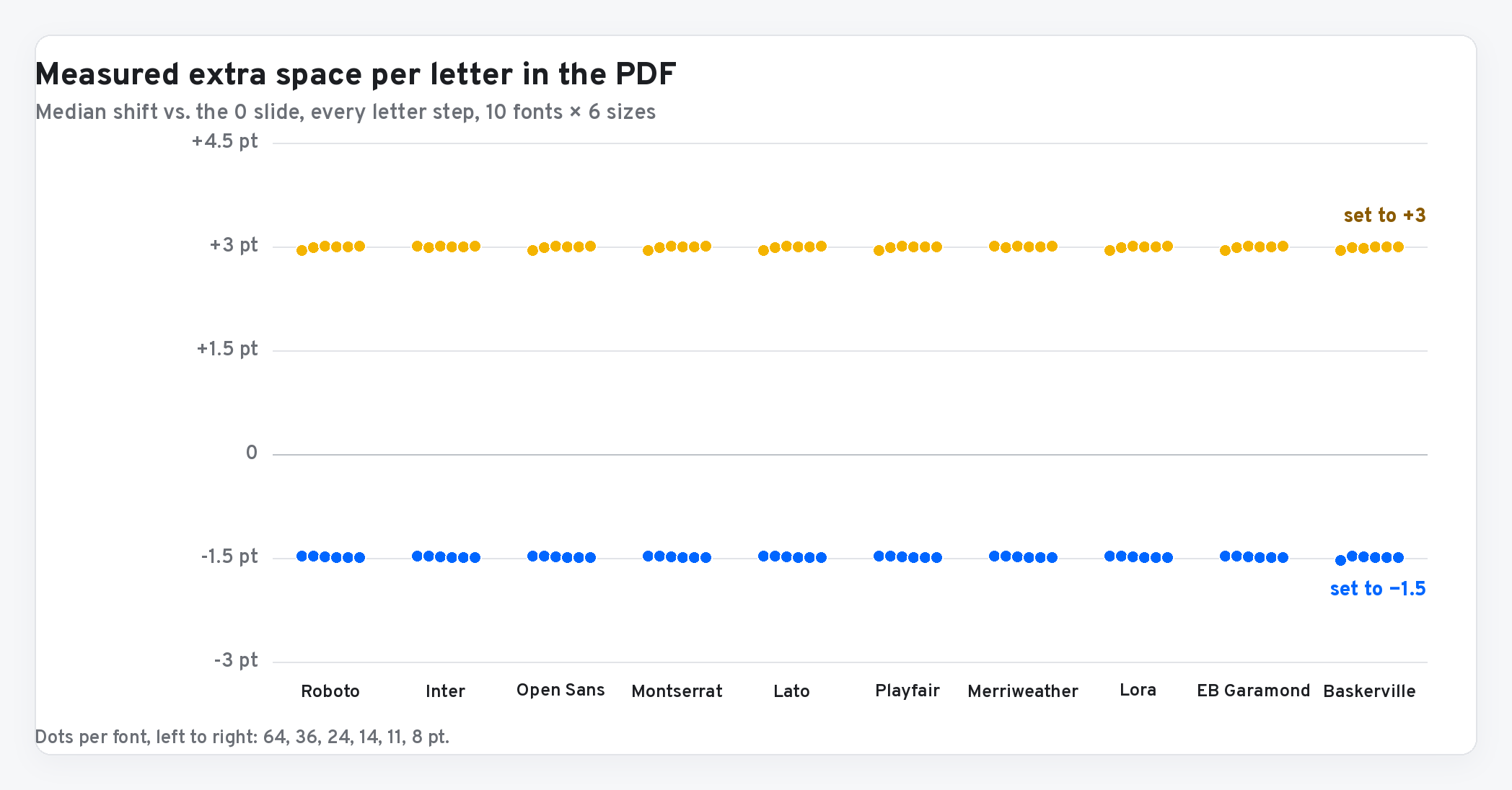
- Letter spacing carries into the PDF exactly: +3 is +3.00 pt per letter, −1.5 is −1.50, in every font and size we tried.
- Kerning is kept. Tight pairs like AV and To move by the same amount as every other pair.
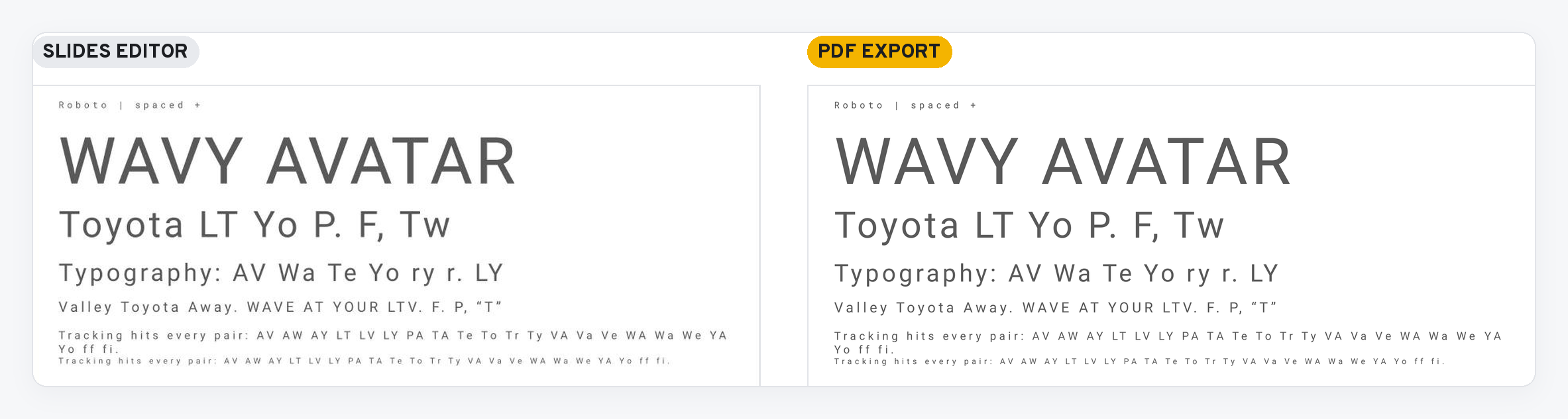
- The editor and the PDF line up within a pixel, line breaks included.
- Watch three things: the unit is points (not relative to size), any spacing turns ligatures off, and Open Sans has no kerning at all.
The first question after our letter spacing post was the right one: does it hold up when you export to PDF, or does kerning go strange on some fonts? We ran the test.
Short answer: it survives
Left is the Slides editor. Right is the PDF from the same deck. Same spacing, same line breaks, same letters in the same places.
How we tested
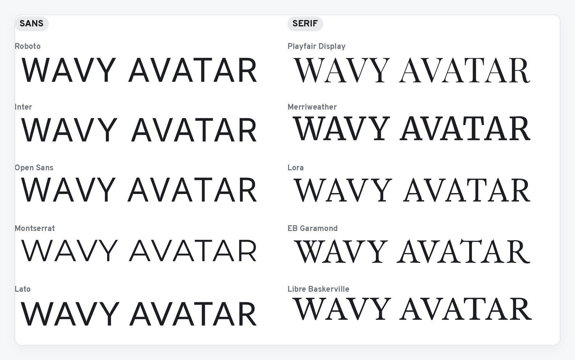
- 10 fonts that Slides offers from Google Fonts. Sans: Roboto, Inter, Open Sans, Montserrat, Lato. Serif: Playfair Display, Merriweather, Lora, EB Garamond, Libre Baskerville.
- 6 sizes on every slide: 64, 36, 24, 14, 11 and 8 pt, from headline to footnote.
- The hard pairs: AV, WA, LT, LY, Te, To, Tw, Yo, P., F, and friends, plus ff and fi.
- Three versions of each slide: letter spacing 0, +3 and −1.5.
Then we exported the deck to PDF and read the position of every letter out of the file. The 0 slide is the baseline. Anything that moved, we can see.
The test PDF is here if you want to check our numbers.
Tracking: exact
Every letter in the +3 slides sits 3 pt further along than the one before it, compared with the 0 slide. Every letter at −1.5 sits 1.5 pt closer. That held for all ten fonts and all six sizes.
Kerning: kept
This was the real worry. Some renderers drop kerning once letters get extra space. Slides doesn’t. Roboto pulls A and V 2.69 pt closer at 64 pt. With +3 applied, that pair moves by the same 3 pt as every other pair, so the kern is still there underneath.
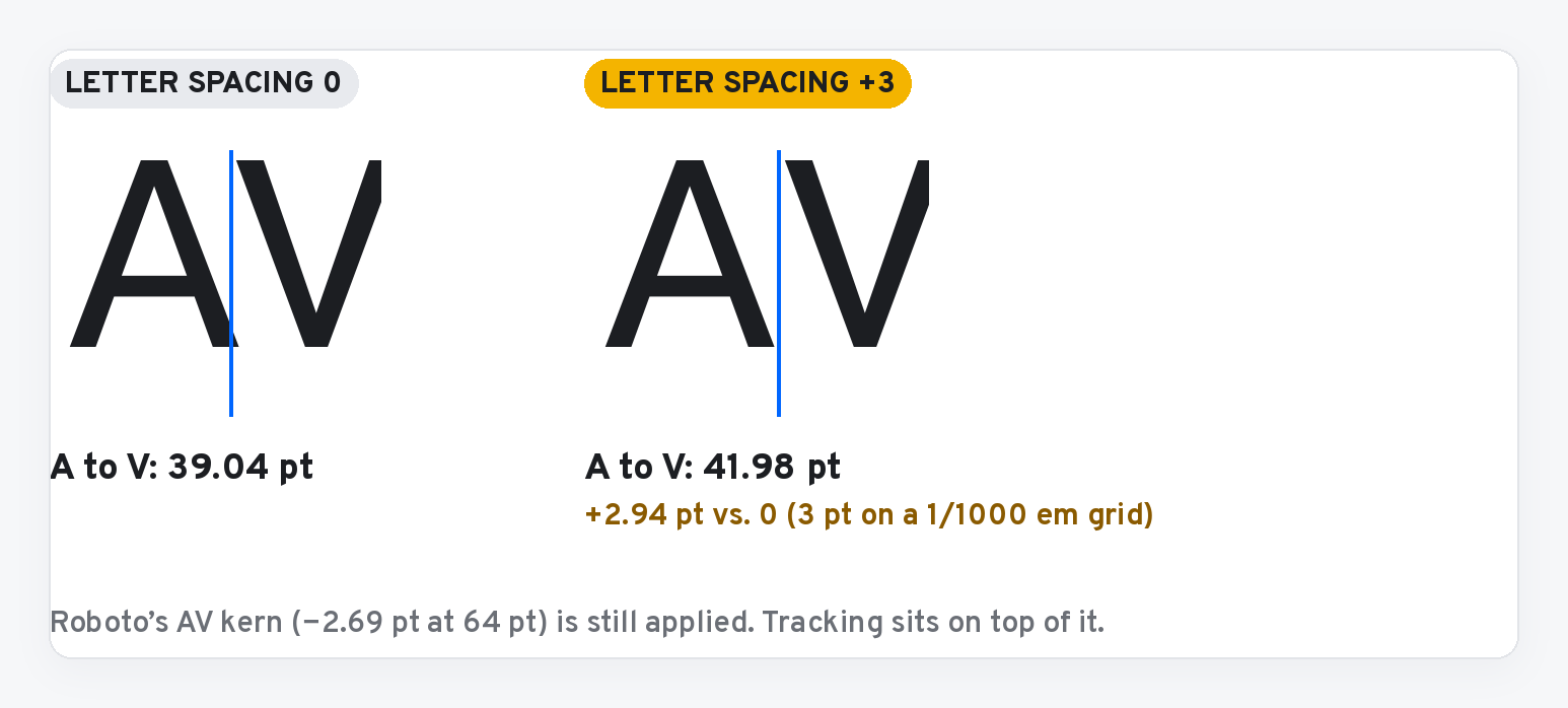
If kerning had been lost, AV would have jumped by more than 3 pt. It didn’t, in any font.
Editor and PDF match
We laid a screenshot of the editor over a render of the PDF. Grey means both put ink in the same place.
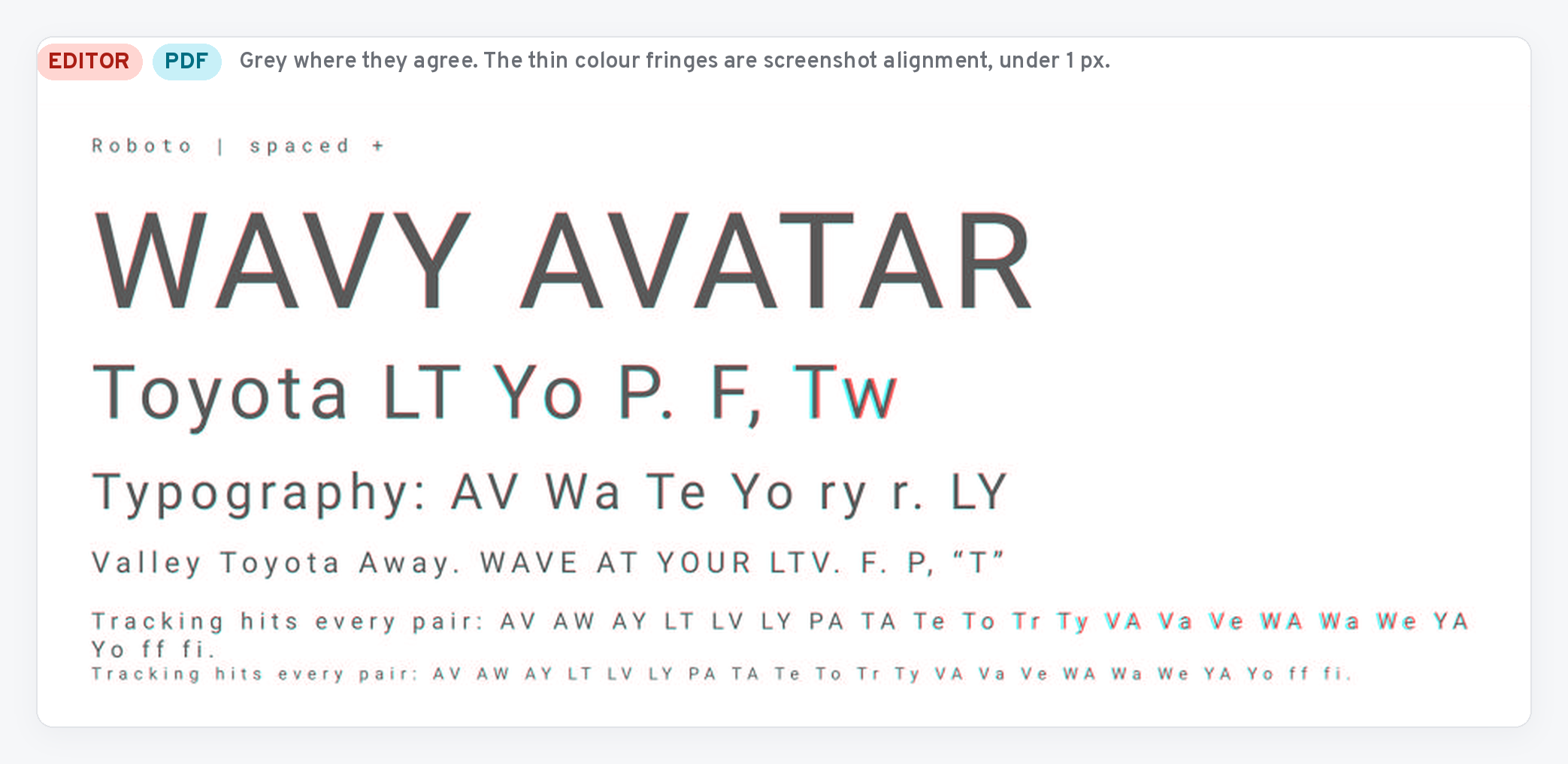
Line breaks match too. At +3, the 11 pt line got too long for its box and wrapped. It wrapped after the same word in both.
Three things that do change
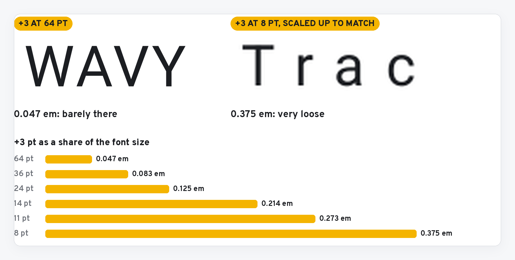
1. The unit is points, not a share of the font size. The dialog shows no unit. It’s points. So +3 is barely visible on a 64 pt headline and very loose on 8 pt type. Pick the value per text style, not once for the whole deck.
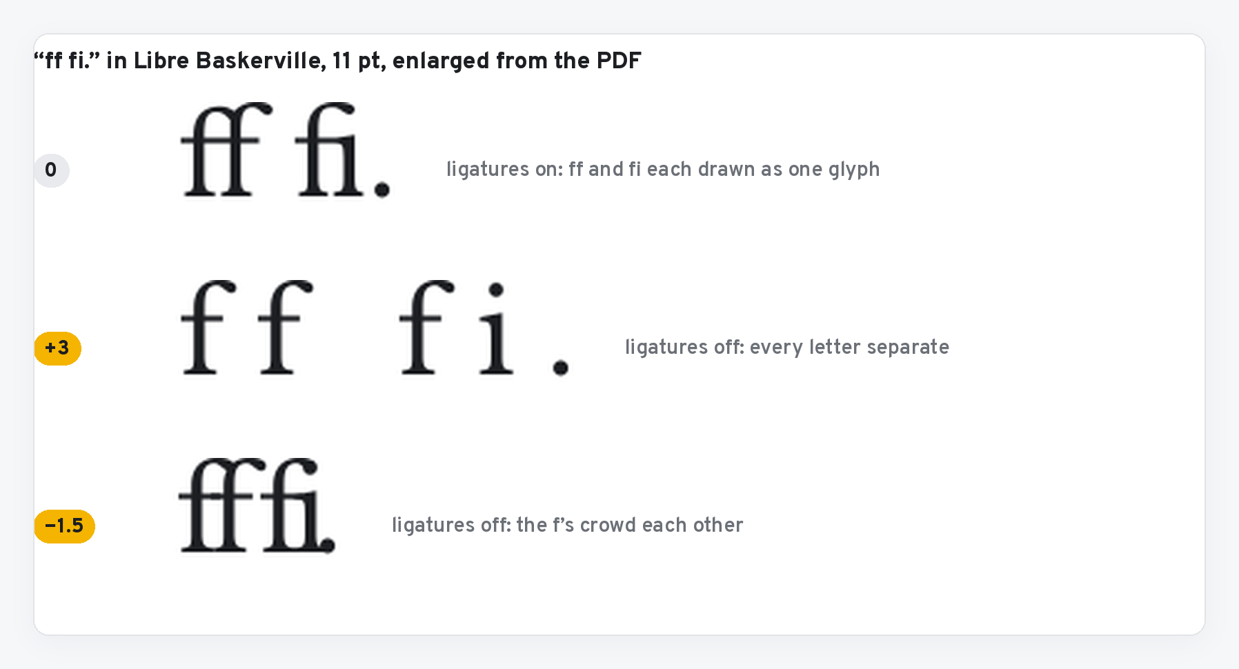
2. Any spacing turns ligatures off. At 0, fonts like Libre Baskerville join ff and fi into single glyphs. At +3 or −1.5 they come apart. Opened up, that reads fine. Pulled in, the f’s can crowd each other.
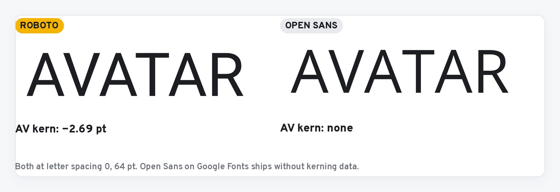
3. If a font looks badly kerned, it might be Open Sans. Open Sans showed zero kerning everywhere, at every setting, in the editor and the PDF. That’s the font, not Slides: Open Sans as served by Google Fonts has no kerning data. AV and To look loose in it no matter what you set.
What to do with it
- Use letter spacing in decks you send as PDFs. It holds.
- Set it per text style: small positive values for all-caps labels, small negative values for big headlines, 0 for body.
- Check line breaks after you add positive spacing. They move in the editor, and the PDF follows.
- For headlines with lots of A, V, W and T, choose a font that kerns. Swap Open Sans for Inter or Roboto.
Not tested yet: PowerPoint export, bold and italic weights, and Docs, which doesn’t have the control yet.